13.2 Customizing Templates
The Application Express engine creates the user interface of an application based on a named collection of templates called a theme. Templates control the look and feel of the components in your application. If you must create a custom template, it is generally easier to start with an existing template and then modify it. Once you have created one or more default templates, you can modify those templates to fit your specific needs.
See Also:
"Managing Themes"13.2.1 About Cascading Style Sheets
A cascading style sheet (CSS) provides a way to control the style of a web page without changing its structure. When used properly, a CSS separates visual attributes such as color, margins, and fonts from the structure of the HTML document. Oracle Application Express includes themes that contain templates that reference their own CSS. The style rules defined in each CSS for a particular theme also determine the way reports and regions display.
When using built-in themes, you can find the theme specific CSS files in the following locations:
/i/themes/theme_xx
/i/themes/theme_xx/css
Theme specific image can be found in the following locations:
/i/themes/theme_xx
/i/themes/theme_xx/images
Where xx is the Oracle Application Express version number. Theme specific CSS files include the Oracle Application Express version number to preserve backward compatibility for imported applications using older versions of a theme.
See Also:
"Using Custom Cascading Style Sheets"13.2.2 Selecting a Default Page Template
You can specify a default page template in two ways:
-
Select a default page template within a specific theme.
-
Select a specific page template on a page-by-page basis.
By default, the Application Express engine uses the Page template specified on the Themes page.
13.2.2.1 Selecting a Page-level Template Within a Theme
To specify a default page template within a theme:
-
Navigate to the Themes page. See "Accessing the Themes Page".
-
Select a theme name.
The Create/Edit Theme page appears.
-
Scroll down to Component Defaults. Make a selection from the Page list.
-
Click Apply Changes at the top of the page.
See Also:
"Editing a Theme"13.2.2.2 Selecting a Page-level Template for a Specific Page
To specify a page-level template for a specific page:
-
On the Workspace home page, click the Application Builder icon.
-
Select an application.
-
Select a page.
The Page Definition appears.
-
To access the Page Definition Edit Page:
-
Tree view - Under Page Rendering, double-click the page title at the top of the tree.
-
Component view- Under Page, click the Edit icon.
The Page Attributes page appears.
-
-
Locate the section Display Attributes.
-
Make a selection from the Page Template list.
-
Click Apply Changes.
13.2.3 Creating a New Template
If you must create a custom template, it is generally easier to start with an existing template and then modify it. Once you have created one or more default templates, you can modify those templates to fit your specific needs.
To create a custom template:
-
Navigate to the Templates page.
-
On the Workspace home page, click the Application Builder icon.
-
Select an application.
-
Click Shared Components.
-
Under User Interface, select Templates.
-
-
Click Create.
-
Select the type of template you want to create and click Next.
-
Select a creation method:
-
From Scratch
-
As a Copy of an Existing Template
-
-
Follow the on-screen instructions.
Tip:
Make sure you associate your template with the correct theme.13.2.4 Viewing Template Reports
Application Builder includes reports describing template utilization, subscription, published templates and edit history.
To view template reports for the current application:
-
Navigate to the Templates page.
-
On the Workspace home page, click the Application Builder icon.
-
Select an application.
-
Click Shared Components.
-
Under User Interface, select Templates.
-
-
You can narrow the display by making a selection from the following lists and clicking Go.
-
Template Name - Enter a case insensitive query.
-
Theme - View only templates in a specific theme.
-
Referenced - Select a type of template to display. Options include:
-
All Templates
-
Templates Referenced
-
Templates Not Referenced
-
-
Type - Select a template type.
-
Since - Restrict the report to a specific time frame. Select the amount of time to include in your report.
-
Subscribed - Specify whether to view All Templates, Subscribed Templates, or Not Subscribed Templates.
-
-
To view template reports, click the following tabs:
-
Subscription displays subscribed templates in your application.
-
Utilization displays template utilization in the current application for all template types (page, report, region, label and list).
-
History details recent changes to templates by developers and the last update date.
-
13.2.5 Managing Templates
You can view all available templates on the Templates page. Alternatively, you can access a template associated with a specific page on the Page Definition.
See Also:
"Viewing All Templates in a Theme"13.2.5.1 Viewing Templates on the Templates Page
-
Navigate to the Templates page.
-
On the Workspace home page, click the Application Builder icon.
-
Select an application.
-
Click Shared Components.
-
Under User Interface, select Templates.
The Templates page appears.
-
-
You can narrow the display by making a selections from the following lists and clicking Go.
-
Template Name - Enter a case insensitive query.
-
Theme - View only templates in a specific theme.
-
Referenced - Select a type of template to display.
-
Type - Select a template type.
-
Since - Restrict the report to a specific time frame. Select the amount of time to include in your report.
-
Subscribed - Specify whether to view All Templates, Subscribed Templates, or Not Subscribed Templates.
-
-
To see a preview of a template, click the Run icon in the Preview column.
Note that not all template types have the preview capability.
-
To view or edit a template definition, click the template name.
The template definition appears.
Each template definition is divided into sections. You can access these sections by manually scrolling, or by clicking a navigation button at the top of the page. When you select a button at the top of the page, the selected section appears and all other sections are temporarily hidden. To view all sections of the page, click Show All.
-
Edit the appropriate attributes.
If you edit a template, you can make changes in one window and run your application in another by selecting the Return to Page check box on the right side of the template definition page. Selecting this check box keeps the page you are editing current after you click Apply Changes.
-
Click Apply Changes.
13.2.5.2 Viewing Templates Associated with a Specific Page
To view templates associated with a specific page:
-
On the Workspace home page, click the Application Builder icon.
-
Select an application.
-
Select a page.
The Page Definition appears. Templates associated with the current page display under the Templates heading in the far right column.
-
To view or edit a template definition, click the template name.
The Template Definition appears.
Each template definition is divided into sections. You can access these sections by manually scrolling, or by clicking a navigation button at the top of the page. When you select a button at the top of the page, the selected section appears and all other sections are temporarily hidden. To view all sections of the page, click Show All.
-
Edit the appropriate attributes.
If you edit a template, you can make changes in one window and run your application in another by selecting the Return to Page check box on the right side of the template definition page. Selecting this check box keeps the page you are editing current after you click Apply Changes.
-
Click Apply Changes.
13.2.5.3 Replacing Templates
You can update the template associated with a component using the Replace Templates Wizard.
To replace the template associated with a component:
-
Navigate to the Templates page.
-
On the Workspace home page, click the Application Builder icon.
-
Select an application.
-
Click Shared Components.
-
Under User Interface, select Templates.
The Templates page appears.
-
-
From the Task list, select Replace Templates.
-
From Template Type, select a template and click Next.
-
For Replace Templates, select the following:
-
Change From - Select the template you want to change.
-
Change To - Select the template you want to change to.
-
Click Next.
-
-
Click Finish.
13.2.5.4 Replacing All Templates within an Application
To replace all templates within an application with templates from another application:
-
Navigate to the Templates page.
-
On the Workspace home page, click the Application Builder icon.
-
Select an application.
-
Click Shared Components.
-
Under User Interface, select Templates.
The Templates page appears.
-
-
From the Task list, select Replace templates in this application with templates from another application.
-
For Replace Templates:
-
Replace from Application - Select an application.
-
User Interface - Select the type of user interface for which this application has been developed.
-
Click Next.
-
-
On Replace Templates, select a new template for each component and then select an Action:
-
Replace copies the template definition
-
Replace/Subscribe copies the templates and adds a subscription.
-
-
Click Replace Templates.
13.2.5.5 Viewing Region Position Utilization by Page Template
Regions are organized on a page by position (or Display Point). The possible display points for a region are determined by the page-level template.
To view region position utilization by page template:
-
Navigate to the Templates page.
-
On the Workspace home page, click the Application Builder icon.
-
Select an application.
-
Click Shared Components.
-
Under User Interface, select Templates.
The Templates page appears.
-
-
From the Task list, select View page template region position utilization.
The Region Display Point Utilization report appears.
13.2.5.6 Unsubscribing to Templates
A subscribed template is a template that has its definition maintained in another template, the referenced template. If your application uses subscribed templates, you can unsubscribe to templates on the Unsubscribe Templates page.
To unsubscribe to templates:
-
Navigate to the Templates page.
-
On the Workspace home page, click the Application Builder icon.
-
Select an application.
-
Click Shared Components.
-
Under User Interface, select Templates.
The Templates page appears.
-
-
From the Task list, select Unsubscribe Templates.
The Unsubscribe Templates page appears.
-
To unsubscribe to a specific template type within the current theme, select the template type and click Unsubscribe.
13.2.5.7 Publishing Templates
Use the Publish Templates page to view templates that are subscribed to by other templates in your workspace.
To publish master template content to subscribing templates:
-
Navigate to the Templates page.
-
On the Workspace home page, click the Application Builder icon.
-
Select an application.
-
Click Shared Components.
-
Under User Interface, select Templates.
The Templates page appears.
-
-
Click the Publish tab.
The Published Templates page appears.
-
Select those you want to publish and click Publish Checked.
13.2.6 Breadcrumb Templates
A breadcrumb template controls the display of breadcrumb entries. You select a breadcrumb template when you create a region.
13.2.6.1 About Breadcrumb Style Navigation
Breadcrumbs usually indicate where the current page is relative to other pages in the application. In addition, users can click a specific page to instantly view it. For example, the Oracle Application Express Sample Database Application includes breadcrumb paths at the top of each page.
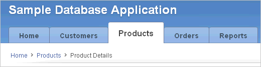
Description of the illustration bc_menu.gif
See Also:
-
Online help for information about using specific sections of the Edit Breadcrumb Template page
13.2.6.2 Breadcrumb Template Attributes
This section describes specific sections of the Edit Breadcrumb Template page. You can access the sections of the page by either scrolling down the page, or by clicking a navigation button at the top of the page. When you select a button at the top of the page, the selected section appears and all other sections are temporarily hidden. To view all sections of the page, click Show All.
13.2.6.2.1 Name
Name identifies the name of the template. Use the Translatable check box to indicate that the template contains text strings that require translation. Theme indicates the theme to which the template is a member.
Template Class identifies a specific use for the template. When you switch to a theme, all templates in one theme are mapped to corresponding templates in another theme. Application Builder accomplishes this template mapping through the assignment of a template class.
13.2.6.2.2 Subscription
Use Subscription to apply an existing template to the current application.
Use Reference Master Breadcrumb Template From to select an existing template in this application or another template in your workspace's schema. By selecting an existing template, you become a subscriber to that template.
To load a copy of a master template, click Refresh.
13.2.6.2.3 Template Type
Select one of the following template styles:
-
Child Breadcrumb Entries displays all breadcrumb entries that are children of the current page parent breadcrumb (that is, peers of the current breadcrumb).
-
Current Breadcrumb displays all breadcrumb entries in sequence with a common parent.
-
Parent Breadcrumb Entries displays all breadcrumb entries for the current pages parent breadcrumb (that is, one level up from the current breadcrumb entry).
-
Parent to Leaf (breadcrumb style) displays the current page breadcrumb entry, its parent to the left, and so on, until the root node is reached.
13.2.6.2.4 Definition
Table 13-3 describes available breadcrumb Entry attributes.
Table 13-3 Breadcrumb Entry Control attributes
| Attribute | Description |
|---|---|
|
Before First |
Defines text that displays before the first breadcrumb entry. |
|
Current Page Breadcrumb Entry |
Defines the look of a breadcrumb entry that corresponds to the current page. This attribute supports the following substitution strings:
For example: <li><a href="#LINK#">#NAME#</a> |
|
Non Current Page Breadcrumb Entry |
Defines the look of a breadcrumb entry that does not correspond to the current page. This attribute supports the following substitution strings:
For example: <li><a href="#LINK#">#NAME#</a> |
|
After Last |
Defines text that displays after the last breadcrumb entry. |
|
Between Level |
Defines text that displays between levels of breadcrumb entries. For example, if a breadcrumb has three levels this text would display at the "X" in the example that follows: main X cars X porsche X 911 |
|
Maximum Levels |
Specifies the number of levels that appear when displaying breadcrumbs in a breadcrumb style. |
13.2.7 Button Templates
Button templates enable developers to customize the look and feel of a button. To build a button, you can use multiple images or HTML tags. Using button templates is optional.
13.2.7.1 Button Template Attributes
This section describes specific sections of the Edit Button Template page. You can access the sections of the page by either scrolling down the page, or by clicking a navigation button at the top of the page. When you select a button at the top of the page, the selected section appears and all other sections are temporarily hidden. To view all sections of the page, click Show All.
13.2.7.1.1 Name
Template Name identifies the name of the template. Use the Translatable check box to indicate if the template contains text strings that require translation. Theme indicates the theme to which the template is a member.
Template Class identifies a specific use for the template. When you switch to a theme, all templates in one theme are mapped to corresponding templates in another theme. Application Builder accomplishes this template mapping through the assignment of a template class.
13.2.7.1.2 Subscription
Use Subscription to apply an existing template to the current application.
Use Reference Master Template From to select an existing template in this workspace or another template in your workspace's schema. By selecting an existing template, you become a subscriber to that template.
To load a copy of a master template, click Refresh.
13.2.7.1.3 Definition
Normal Template defines the button template that displays if the button type is Normal. You can include standard application substitutions. For example, &ITEM_NAME. values can be substituted at rendering time.
Hot Template defines the button template that displays if the button type is Hot. You have the option of including standard application substitutions. For example, &ITEM_NAME. values can be substituted at rendering time.
Button templates support the following substitution strings:
-
The
#LABEL#substitution string is replaced with a button label. -
The
#LINK#substitution string is replaced with generated JavaScript code to control the button's behavior. Depending on the button's action, this code could either a call toapex.submitto submit the page, a redirect to a page, a redirect to some other URL supplied, execution of some custom JavaScript, orvoid(0)to do nothing (when the behavior is be defined separately with Dynamic Actions). Since the#LINK#prefixes the generated JavaScript code with 'javascript:', use it in anHREFattribute. -
The
#JAVASCRIPT#substitution string is replaced with generated JavaScript code to control the button's behavior. Depending on a button's action, this code could be either a call toapex.submitto submit the page, a redirect to a page, a redirect to some other URL supplied, execution of some custom JavaScript orvoid(0)to do nothing (when the behavior may be defined separately with Dynamic Actions).Tip:
Since#JAVASCRIPT#does not prefix the generated JavaScript code with 'javascript:', use it in an onclick attribute. -
The
#BUTTON_ID#substitution string is replaced with the ID for the button. This is either the button's Static ID, if defined, or an internally generated ID in the format. For example:'B' || [Internal Button ID]
-
The
#BUTTON_CSS_CLASSES#substitution string is replaced with the button CSS classes property from the button definition. -
The
#BUTTON_ATTRIBUTES#substitution string is replaced with the button attributes property from the button definition.
Tip:
All substitution string must be in uppercase.13.2.8 Calendar Templates
Calendar templates control the appearance and placement of a calendar. Calendar templates frequently use HTML tables to arrange dates. You place calendar attributes using substitution strings such as #DD# and #MONTH#.
13.2.8.1 About Supported Calendar Template Substitution Strings
A list of supported substitution strings appears on the right side of the Edit Calendar Template page. Note that template substitution strings must be in uppercase letters and begin and end with a number sign (#).
13.2.8.2 Calendar Template Attributes
This section describes specific sections of the Edit Calendar Template page. You can access the sections of the page by either scrolling down the page, or by clicking a navigation button at the top of the page. When you select a button at the top of the page, the selected section appears and all other sections are temporarily hidden. To view all sections of the page, click Show All.
13.2.8.2.1 Name
Name identifies the name of the template. Use the Translatable check box to indicate if the template contains text strings that require translation.Theme indicates the theme to which the template is a member.
Template Class identifies a specific use for the template. When you switch to a theme, all templates in one theme are mapped to corresponding templates in another theme. Application Builder accomplishes this template mapping through the assignment of a template class.
13.2.8.2.2 Subscription
Use Subscription to apply an existing template to the current application.
Use Reference Master Label Template From to select an existing template in this workspace or another template in your workspace's schema. By selecting an existing template, you become a subscriber to that template.
To load a copy of a master template, click Refresh.
13.2.8.2.3 Comments
Use this attribute to record comments about this component.
Monthly Calendar, Weekly Calendar, Daily Calendar, and List Calendar
Use the Monthly Calendar, Weekly Calendar, Daily Calendar, and List Calendar attributes to control the appearance and placement of specific calendars.
To learn more about a specific attribute, click the attribute label. When help is available, the cursor changes to an arrow and question mark when you pass the cursor over an item. See "About Field-Level Help".
13.2.9 Label Templates
Label templates are designed to centrally manage HTML markup of page item labels. Each item can have an optional label. You can control how these labels display using label templates. For example, you could create a label template called Required Field that references an image (such as an asterisk) to indicate to the user that the field is required.
Label templates enable you to define a before-and-after text string that gets prepended and appended to the item.
13.2.9.1 Label Template Attributes
This section describes specific sections of the Edit Label Template page. You can access the sections of the page by either scrolling down the page, or by clicking a navigation button at the top of the page. When you select a button at the top of the page, the selected section appears and all other sections are temporarily hidden. To view all sections of the page, click Show All.
13.2.9.1.1 Name
Template Name identifies the name of the template. Use the Translatable check box to indicate that the template contains text strings that require translation. Theme indicates the theme to which the template is a member.
Template Class identifies a specific use for the template. When you switch to a theme, all templates in one theme are mapped to corresponding templates in another theme. Application Builder accomplishes this template mapping through the assignment of a template class.
13.2.9.1.2 Subscription
Use Template Subscription to apply an existing template to the current application.
Use Reference Master Label Template From to select an existing template in this workspace or another template in your workspace's schema. When you select an existing template, you become a subscriber to that template.
To load a copy of a master template, click Refresh.
13.2.9.1.3 Definition
In Before Label, enter HTML to display before the item label. Before Label supports the following substitution strings:
-
#CURRENT_FORM_ELEMENT# -
#CURRENT_ITEM_ID# -
#CURRENT_ITEM_NAME# -
#CURRENT_ITEM_HELP_TEXT#
For example:
<label for="#CURRENT_ITEM_NAME#">
<a href="javascript:popupFieldHelp('#CURRENT_ITEM_ID#',
  '&APP_SESSION.','&CLOSE.')" >
In this example the label automatically displays after the HTML in this region. Therefore, if you open an <a> tag, you should close it in the After Label region.
In After Label, enter HTML to display after the item label. Since the label automatically displays before the HTML in this region, any open HTML tags in the Before Label region should be closed. For example:
</a></label>
In Before Label, enter HTML to display before the item label. This attribute supports the following substitution strings:
-
#CURRENT_FORM_ELEMENT# -
#CURRENT_ITEM_ID# -
#CURRENT_ITEM_NAME# -
#CURRENT_ITEM_HELP_TEXT#
13.2.9.1.4 Error Display
In On Error Before Label, enter HTML to precede the item label when an application displays an inline validation error message for the item. For example:
<font class="fieldtitleleft">#ERROR_MESSAGE#
This attribute supports the following substitution strings:
-
#CURRENT_FORM_ELEMENT# -
#CURRENT_ITEM_ID# -
#CURRENT_ITEM_NAME# -
#CURRENT_ITEM_HELP_TEXT#
In On Error After Label, enter HTML to be appended to the item label when an application displays an inline validation error message for the item. For example:
]</font>
This attribute supports the following substitution strings:
-
#CURRENT_FORM_ELEMENT# -
#CURRENT_ITEM_ID# -
#CURRENT_ITEM_NAME# -
#CURRENT_ITEM_HELP_TEXT#
13.2.9.1.5 Field Container
In Before Label and Item enter HTML to be displayed before the label and item. This is typically used to wrap an item into a DIV container or field set. The Before Label and Item attribute is only rendered for pages that do not use a table grid to display form items. This includes any page using a mobile page template.
This attribute supports the following substitution strings:
-
#CURRENT_FORM_ELEMENT# -
#CURRENT_ITEM_ID# -
#CURRENT_ITEM_NAME# -
#CURRENT_ITEM_HELP_TEXT# -
#CURRENT_ITEM_CONTAINER_ID#
In order for page items rendered on pages that do not use a table grid to be reliably hidden and shown with the Oracle Application Express JavaScript APIs, you should ensure the HTML container element defined in this attribute also has an id="#CURRENT_ITEM_CONTAINER_ID#" defined. If this is not done, you may find some elements of the item are not successfully hidden and shown.
13.2.9.2 Using #CURRENT_ITEM_HELP_TEXT# to Create Item Help
You can use the #CURRENT_ITEM_HELP_TEXT# substitution string to create inline page item Help text when a page is rendered. For example, you can use this substitution string to create page item Help text which displays as a tooltip when the mouse hovers over the page item label. This placeholder enables you to include help text on the page when it's rendered without having to perform an expensive AJAX call.
Tip:
Only use this placeholder if the Help text is short. The generated page always includes the help text of all page items independent if the user actually hovers over the label of a page item to display the help text.Before Label:
<label for="#CURRENT_ITEM_NAME#" class="optional"><span>
class="helpText">#CURRENT_ITEM_HELP_TEXT#</span>
After Label:
</label>
13.2.10 List Templates
A list is a shared collection of links. You control the appearance of a list through list templates. Using template attributes, you can also define a list element to be either current or non current for a specific page.
13.2.10.1 About Hierarchical Lists
Oracle Application Express supports hierarchical lists. To create a hierarchical list, you must:
-
Select a list template that supports hierarchical lists. To determine which list templates support hierarchical lists, look for templates having the naming convention "with Sublist."
-
Select a Parent List Entry when you create each list entry.
See Also:
-
Online Help for information about using specific sections of the Edit List Template page
13.2.10.2 List Template Attributes
This section describes specific sections of the Edit List Template page. You can access the sections of the page by either scrolling down the page, or by clicking a navigation button at the top of the page. When you select a button at the top of the page, the selected section appears and all other sections are temporarily hidden. To view all sections of the page, click Show All.
13.2.10.2.1 Name
Name identifies the name of the template. Use the Translatable check box to indicate that the template contains text strings that require translation. Theme indicates the theme to which the template is a member.
Template Class identifies a specific use for the template. When you switch to a new theme, all templates in one theme are mapped to corresponding templates in another theme. Application Builder accomplishes this template mapping through the assignment of a template class.
13.2.10.2.2 Subscription
Use Subscription to apply an existing template to the current application.
Use Reference Master List Template From to select an existing template in this workspace or another template in your workspace's schema. By selecting an existing template, you become a subscriber to that template. To load a copy of a master template, click Refresh.
13.2.10.2.3 Before List Entry
Enter HTML that displays before any list elements. You can use this attribute to open an HTML table or HTML table row.
13.2.10.2.4 Template Definition
Defines current and noncurrent list templates. Supported substitution strings include #LINK#, #TEXT#, #TEXT_ESC_SC#, #IMAGE_PREFIX#, #IMAGE#, #IMAGE_ATTR#, and #A01#...#A10#.
Template Definition attributes include:
-
List Template Current. Enter HTML or text to be substituted for the selected (or current) list template.
-
List Template Current with Sub List Items. Enter HTML or text to be substituted for the selected (or current) list template when an item has sublist items. If not specified, the current list item template is used.
-
List Template Noncurrent. Enter HTML or text to be substituted for the unselected (or noncurrent) list template.
-
List Template Noncurrent with Sub List Items. Enter HTML or text to be substituted for the unselected (or noncurrent) list template used when an item has sublist items. If not specified, the current list item template is used.
-
Between List Elements. Enter HTML that displays between list elements. This attribute is ignored if no HTML is specified.
13.2.10.2.5 Template Definitions for First Entry
Available attributes include:
-
List Template Current (First). If defined, this is used for the first list item. Enter HTML or text to be substituted for the selected (or current) list template.
-
List Template Current with Sub List Items (First). If defined, this is used for the first list item. HTML or text to be substituted for the selected (or current) list template used when item has sub list items.
-
List Template Noncurrent (First). If defined, this is used for the first list item. Enter HTML or text to be substituted for the unselected (or noncurrent) list template.
-
List Template Noncurrent with Sub List Items (First). If defined, this is used for the first list item. HTML or text to be substituted for the unselected (or noncurrent) list template used when item has sub list items.
13.2.10.2.7 Sublist Entry
Defines current and noncurrent list templates. Supported substitution strings include #LINK#, #TEXT#, #IMAGE_PREFIX#, #IMAGE#, #IMAGE_ATTR#, #A01#...#A10#, #LIST_ITEM_ID#, and #PARENT_LIST_ITEM_ID#.
Sub List Entry attributes include:
-
Sub List Template Current. Enter HTML or text to be substituted for the selected (or current) list template.
-
Sub List Template Current with Sub List Items. Enter HTML or text to be substituted for the selected (or current) list template when an item has sublist items. If not specified, the current list item template is used.
-
Sub List Template Noncurrent. Enter HTML or text to be substituted for the unselected (or noncurrent) list template.
-
Sub List Template Noncurrent with Sub List Items. Enter HTML or text to be substituted for the unselected (or noncurrent) list template used when an item has sublist items. If not specified, the current list item template is used.
-
Between Sub List Items. Enter HTML that displays between list elements. This attribute is ignored if no HTML is specified.
13.2.10.2.9 After List Entry
Enter HTML that displays after displaying all list elements. You can use this attribute to close an HTML table opened in the Before List Elements attribute.
13.2.11 Page Templates
Page templates define the appearance of a page. Each template consists of a header template, a body template, a footer template, and several subtemplates. If you do not specify a page template as a page-level attribute, then the Application Express engine uses the default page template defined on the Create/Edit Theme page.
Page templates combine static HTML with substitution strings that are replaced at runtime. You use substitution strings to indicate the existence and placement of a component within a page template. You can further specify how a component should display using subtemplates.
13.2.11.1 About Supported Page Template Substitution Strings
Table 13-4 describes the available page template substitution strings. Note that all template substitution strings must be in uppercase letters and begin and end with a number sign (#).
To view a report of substitution strings supported by a given template, look at the Substitution Stings section of the Edit Page Template page. See "Page Template Attributes".
Table 13-4 Page Template Substitution Strings
| Substitution String | From | Description |
|---|---|---|
|
Header Template |
JavaScript files and code used by Oracle Application Express. |
|
|
Header Template |
CSS files used by Oracle Application Express. |
|
|
Body |
Where the Body displays. If the Body is null, then |
|
|
Footer Template |
Customize link. |
|
|
Footer template |
Where the HTML close form tag |
|
|
Header Template |
Where the HTML open form tag |
|
|
Header Template |
Cascading style sheet files created by components. |
|
|
Header Template |
JavaScript code created by components as needed. |
|
|
Body |
Displays the Global Notification attribute. Global notifications are intended to communicate system status, such as pending system downtime. You can also use See Also: "Global Notification" |
|
|
Header Template |
Used after the |
|
|
All |
High Contrast toggle. |
|
|
Body |
Application image or log. In the Logo section of the Edit Application Definition page, you can identify an image and image attributes for an application logo. To use this feature, you must also include the See Also: "Logo" |
|
|
Body |
Navigation bar. See Also: "Subtemplate" for information about the Navigation Bar subtemplate |
|
|
Body |
Defines where a summary of inline error messages displays. Inline error messages can display next to a field, inline in the notification area, or both. |
|
|
Header Template |
Page onload. Use this string as a substitute in a JavaScript call to be executed when a page is loaded by the web browser. The JavaScript to be called can vary for each page. |
|
|
Header Template |
Cascading style sheet files and inline style defined on the page-level. |
|
|
Header Template |
JavaScript files and code defined on the page-level. |
|
|
All |
Page Static ID (for example |
|
|
Page |
Default page transition used to navigate to other pages in a jQuery Mobile application. You must use this new placeholders in a <div id="#PAGE_STATIC_ID#" data-role="page" data-apex-page-transition="#PAGE_TRANSITION#" data-apex-popup-transition="#POPUP_TRANSITION#" data-url="#REQUESTED_URL#"> |
|
|
All |
Display of parent tabs. See Also: "Parent Tab Attributes" |
|
|
Page |
Default page transition used to open a dialog in a jQuery Mobile application. You must use this new placeholders in a <div id="#PAGE_STATIC_ID#" data-role="page" data-apex-page-transition="#PAGE_TRANSITION#" data-apex-popup-transition="#POPUP_TRANSITION#" data-url="#REQUESTED_URL#"> |
|
|
Body |
Region Position 1. |
|
|
Body |
Region Position 2. |
|
|
Body |
Region Position 3. |
|
|
Body |
Region Position 4. |
|
|
Footer Template |
Region Position 5. |
|
|
All |
Region Position 6. |
|
|
Body |
Region Position 7. |
|
|
Body |
Region Position 8. |
|
|
All |
Page URL which was requested by the browser |
|
|
All |
Screen Reader toggle. |
|
|
Body |
Success message. Defines where page success and error messages appear. If the page process runs without raising errors, then this text displays. You can customize the display of the success message for each template by adding HTML to be displayed before and after the success message. |
|
|
|
All |
Hyperlink for home page of desktop user interface. |
|
|
All |
Hyperlink for home page of smart phone user interface. |
|
Body |
Display of standard tabs. See Also: "Standard Tab Attributes" |
|
|
Header Template |
Cascading style sheet files and inline style defined on page template-level. |
|
|
Header Template |
Cascading style sheet files selected for the theme. |
|
|
Header Template |
Defines the page title. Typically included within HTML title tags. |
13.2.11.2 Page Template Attributes
This section describes specific sections of the Edit Page Template page. You can access the sections of the page by either scrolling down the page, or by clicking a navigation button at the top of the page. When you select a button at the top of the page, the selected section appears and all other sections are temporarily hidden. To view all sections of the page, click Show All.
13.2.11.2.1 Name
Name identifies the name of the template. Theme indicates the theme to which the template is a member.
Template Class identifies a specific use for the template. When you switch to a new theme, all templates in one theme are mapped to corresponding templates in another theme. Application Builder accomplishes this template mapping through the assignment of a template class.
Use the Translatable check box to indicate if this template contains text strings that require translation.
13.2.11.2.2 Subscription
Use Subscription to apply an existing template to the current application.
Use Reference Master Page Template From to select an existing template in this workspace or another template in your workspace's schema. By selecting an existing template, you become a subscriber to that template.
To load a new copy of a master template, select Refresh.
13.2.11.2.3 Definition
Each template consists of a header, a body, a footer, and subtemplates. Use substitution strings to include dynamic content. All template substitution strings must be in uppercase letters and begin and end with a number sign (#). See item Help for information about supported substitution strings.
Header is the first section of the page template. Enter HTML that defines the <Head> section of the HTML document. Regions that display or processes and computations that execute AFTER HEADER display or execute immediately after this section in the template that is rendered. For example:
<html> <head> <title>#TITLE#</title> #APEX_CSS# #TEMPLATE_CSS# #THEME_CSS# #PAGE_CSS# #HEAD# </head>
Oracle recommends you include at least #TITLE# and #HEAD# in this template section. See item Help for a specific list of supported substitution strings.
Body is the second section in the page template and is rendered after the header section but before the footer section. Enter HTML that defines the <Body> section of the HTML document. At a minimum, you must include the #BOX_BODY#, #FORM_OPEN# and #FORM_CLOSE# substitution strings in this section of the template. For example:
<body #ONLOAD#> #FORM_OPEN# #BOX_BODY# #FORM_CLOSE# #GENERATED_CSS# #APEX_JAVASCRIPT# #TEMPLATE_JAVASCRIPT# #APPLICATION_JAVASCRIPT# #PAGE_JAVASCRIPT# #GENERATED_JAVASCRIPT# </body>
See item Help for information about supported substitution strings.
Footer is the third section in the page template that displays after the Body. See item Help for information about supported substitution strings
13.2.11.2.4 JavaScript
Available attributes include:
-
File URLs. Enter JavaScript file URLs for code to be loaded on this page. Each URL must be written into a new line. If you provide a minified version of your file you can use the substitution string
#MIN#to include .min in your file URL for a regular page view and an empty string if the page is viewed in debug mode. You can also use the substitution string#APP_VERSION#to include the application's version in the file URL. JavaScript file URLs you enter here replaces the#TEMPLATE_JAVASCRIPT#substitution string in the page template.Do not include opening or closing script tags, just write the URL.
Examples:
-
Standard file reference:
/myjs/main.js
-
Standard file reference which loads the minified file main.min.js for regular page views and main.js in Debug mode:
/myjs/main#MIN#.js
-
Conditional file for Internet Explorer
[if IE]/myjs/ie.js
-
File reference using a query string in the URL referencing the application version, such that when the application is upgraded (and the version is incremented), the browser is instructed to always load the new file and ignore any previously cached files.
/myjs/main.js?version=#APP_VERSION#
-
-
Function and Global Variable Declaration. Enter JavaScript code (for example, functions or global variable declarations) for code to be used in this page template. Consider putting it into an external file to avoid duplication and to leverage browser caching of static files. Code you enter here replaces the
#TEMPLATE_JAVASCRIPT#substitution string in the page template.Do not include opening or closing script tags, just include the JavaScript code.
To reference a shortcut, use
"SHORTCUTNAME". -
Execute when Page Loads. Enter JavaScript code to execute when the page loads. The code is executed after the JavaScript code generated by Oracle Application Express. Code you enter here replaces the
#GENERATED_JAVASCRIPT#substitution string in the page template.Do not include opening or closing script tags, just include the JavaScript code.
13.2.11.2.5 Cascading Style Sheet
Available attributes include:
-
File URLs. Enter Cascading Style Sheet file URLs to be loaded for this page template. Each URL has to be written into a new line. If you provide a minified version of your file you can use the substitution string
#MIN#to include .min in your file URL for a regular page view and an empty string if the page is viewed in debug mode. You can also use the substitution string#APP_VERSION#to include the application's version in the file URL. File URLs you enter here replace the#TEMPLATE_CSS#substitution string in the template.Do not include opening or closing script tags, just include the file URL.
Examples:
-
Standard file reference:
/mycss/main.css
-
Standard file reference which loads the minified file main.min.css for regular page views and main.css in debug mode.
/mycss/main#MIN#.css
-
Conditional media query
[media="only screen and (max-device-width: 480px)"]/mycss/smartphone.css
-
Conditional file for Internet Explorer
[if IE]/mycss/ie.css
-
File reference using a query string in the URL referencing the application version, such that when the application is upgraded (and the version is incremented), the browser is instructed to always load the new file and ignore any previously cached files.
/mycss/main.css?version=#APP_VERSION#
-
-
Inline. Enter Cascading Style Sheet code to be used for this page template. Consider putting it into an external file to avoid duplication and to leverage browser caching of static files. Code you enter here replaces the
#TEMPLATE_CSS#substitution string in the template to avoid duplication and to leverage browser caching of static files.Do not include opening or closing style tags, just include the cascading style sheet code. This example sets the CSS class display_only to bold:
.display_only {
  font-weight:bold;
}
13.2.11.2.6 Subtemplate
Enter the HTML for subtemplates below. Subtemplates are placed inside the body of the page template using substitution strings. Available subtemplates include:
-
Success Message. Enter HTML to replace the string
#SUCCESS_MESSAGE#in the template body, header, or footer. For example:<b>#SUCCESS_MESSAGE#</b>
-
Navigation Bar. Enter HTML or text to replace the string
#NAVIGATION_BAR#in the template header, body, or footer. Use the substitution string#BAR_BODY#to indicate where in the Navigation Bar the entries should appear. For example:<table class="navBar"><tr>#BAR_BODY#</tr></table>
The
#BAR_BODY#substitution string generates the appropriate HTML table cells. -
Navigation Bar Entry. Enter HTML or text to be substituted into the navigation bar
#BAR_BODY#substitution string for each navigation bar entry. Use the these substitution strings to create the navigation bar entry subtemplate.-
#LINK#- entry link -
#TEXT#- entry sub text -
#IMAGE#- entry imageNote that the HTML image ALT, HEIGHT, and WIDTH arguments are included with the HTML IMG tag when supplied with the navigation bar entry.
-
#EDIT#- Inline edit link editing capability -
#WIDTH#- Image width -
#HEIGHT#- Image height -
#COLSPAN#- HTML COLSPAN value -
#ALT#- Image alternative text
-
-
Notification. Enter HTML or text to be substituted when the
#NOTIFICATION_MESSAGE#substitution string is referenced in the template header, body, or footer. The Notification subtemplate supports these substitution strings:-
#MESSAGE# -
#NOTIFICATION_MESSAGE_HEADER#
Use the substitution string
#MESSAGE#to indicate where the body of the message should appear in the Notification Message. For example:<table><tr><td>#MESSAGE#</td></tr></table>
-
13.2.11.2.7 Standard Tab Attributes
You must populate this attribute if your application includes standard tabs. Standard tabs can be placed in the header, body, or footer sections of the page template using the #TAB_CELLS# substitution string. The page template Header/Body/Footer defines the HTML table and rows. This subtemplate defines how these tabs display by defining the specific cell. See item Help for information about supported substitution strings.
Available attributes include:
-
Current Tab. Enter HTML or text to be substituted for the currently selected standard tab. Whether a tab is current is determined by standard tab attributes. Include the
#TAB_TEXT#substitution string to show the displayed name of the tab. For example:<td>#TAB_LABEL#</td>
See item Help for information about supported substitution strings.
-
Non Current Standard Tab. Enter HTML or text to be substituted for the unselected standard tabs. Include the
#TAB_TEXT#substitution string to show the displayed name of the tab. For example:<td><a href="#TAB_LINK#">#TAB_LABEL#</a></td>
See item Help for information about supported substitution strings.
See Also:
"Creating Tabs"13.2.11.2.8 Parent Tab Attributes
You must populate this attribute if your application includes two levels of tabs. Enter HTML or text that to be substituted for the selected parent tabs. Parent tabs can be placed in the header, body, or footer section of the page template using the #PARENT_TAB_CELLS# substitution string. Parent tabs only display with standard tabs.
Available attributes include:
-
Current Parent Tab. Enter HTML or text to be substituted for the selected parent tabs. Whether a tab is current is determined by the page that displays and the standard tab set that the page uses. Include the
#TAB_TEXT#substitution string to show the displayed name of the tab. For example:<td><a href="#TAB_LINK#">#TAB_LABEL#</a></td>
See item Help for information about supported substitution strings.
This attribute is part of the Parent Tab subtemplate and expands the
#PARENT_TAB_CELLS# substitution string. -
Non Current Parent Tab. Enter HTML or text to be substituted for the unselected parent tabs. Include the
#TAB_TEXT#substitution string to show the displayed name of the tab. For example:<td><a href="#TAB_LINK#">#TAB_LABEL#</a></td>
See item Help for information about supported substitution strings.
This attribute is part of the Parent Tab subtemplate and expands the
#PARENT_TAB_CELLS# substitution string.
See Also:
"Creating Tabs"13.2.11.2.9 Image Based Tab Attributes
Use this subtemplate for tabs that are entirely based on images. Available attributes include:
-
Current Image Tab. Enter HTML to be used to indicate that an image-based tab is currently selected. Include the
#TAB_TEXT#substitution string to show the displayed name of the tab. For example:<td>#TAB_TEXT#</td>
-
Non Current Image Tab. Enter the HTML to be used to indicate that an image tab is not currently selected. Include the
#TAB_TEXT#substitution string to show the displayed name of the tab.
13.2.11.2.10 Grid Layout
Available attributes include:
-
Type. Select a grid layout:
-
HTML Table - Uses HTML Tables to position regions, page items, and buttons.
-
Fixed Number of Columns - Used for grids which divide the screen into a fixed number of grid columns.
-
Variable Number of Columns - Used for grids which can display up to "n" number of grid columns depending on how the regions, page items and buttons are positioned.
-
-
Region Table Attributes. This attribute enables you to control the attributes of the
<table>tag. If the Application Express engine displays regions in multiple columns in the same region position, then Oracle Application Express renders an HTML table.
13.2.11.2.11 Display Points
Breadcrumb Display Point applies to generated components that use breadcrumbs. It defines where the breadcrumbs are placed on the page. Sidebar Display Point applies to generated components that use Sidebars. It defines where sidebars are placed on the page.
13.2.11.2.12 Error Page Template Control
Use this attribute when a page template is designated as an error template. Supported substitution strings include:
-
#MESSAGE#and#ADDITIONAL_INFO#- Places the error message. -
#TECHNICAL_INFO#- Displays detailed internal error information which is visible to developers. -
#BACK_LINK#- Displays a link back to the previous page. -
#OK#and#RETURN_TO_APPLICATION#- Returns to translated text strings.
13.2.11.2.13 Substitution Strings
Lists substitution string usage for this template. Substitution strings are used within subtemplates to reference component values. See "About Supported Page Template Substitution Strings"
13.2.12 Popup LOV Templates
Popup LOV templates control how popup lists display for all items defined as POPUP. You can only specify one popup LOV template for each theme.
See Also:
"Creating Lists of Values at the Application Level", "Customizing Templates", and "Managing Themes"13.2.12.1 Popup List of Values Template Attributes
This section describes specific sections of the Edit Popup List of Values Template page. You can access the sections of the page either by scrolling down the page or by clicking a navigation button at the top of the page. When you select a button at the top of the page, the selected section appears and all other sections are temporarily hidden. To view all sections of the page, click Show All.
13.2.12.1.1 Application
Theme indicates the theme to which the template is a member. Template Class identifies a specific use for the template. When you switch to a new theme, all templates in one theme are mapped to corresponding templates in another theme. Application Builder accomplishes this template mapping through the assignment of a template class. Use the Translatable check box to indicate if this template contains text strings that require translation.
13.2.12.1.2 Subscription
Use Subscription to apply an existing template to the current application. Reference Master Popup List of Values Template From to select an existing template in this workspace or another template in your workspace's schema. By selecting an existing template, you become a subscriber to that template.
To load a new copy of a master template, click Refresh.
13.2.12.1.3 Icon
Available attributes include:
-
Popup Icon. Specifies an icon to display to the right of a form field for items of type POPUP. By default, the Application Express engine uses a list.gif image.
-
Popup Icon Attr. Defines image attributes, such as height and width, for the Popup Icon.
-
Popup Color Picker Icon. Defines an icon to display to the right of a form field for items of type Popup Color Picker. By default, the Application Express engine uses
/i/htmldb/icons/palette.gif image. -
Popup Color Picker Icon Attr. Defines image attributes, such as height and width, used to display the Popup Color Picker Icon.
13.2.12.1.4 Search Field
Use these attributes to specify how a Search field displays. Table 13-5 describes available Search Field attributes.
Table 13-5 Search Field Attributes
| Attribute | Description |
|---|---|
|
Before Field Text |
Defines text to display before the popup list of values search field displays. |
|
Filter Width |
Displays the |
|
Filter Max Width |
Displays the |
|
Filter Text Attribute |
Displays the |
|
After Field Text |
Displays this text after displaying the search field, the search button, and the close button. |
13.2.12.1.5 Buttons
Use these attributes to define the button name and attributes for the Find, Close, Next, and Previous buttons. For more information, see item Help.
13.2.12.1.6 Window
Popup lists of values are executed using JavaScript. Use these attribute to control the values of scrollbars=, resizable=, width=, and height=. For information about default values, see item Help. For more information, see item Help.
13.2.13 Region Templates
Region templates control the appearance and placement of region attributes. You place region attributes using substitution strings such as #BODY# and #EDIT#. Template substitution strings must be in upper case and begin and end with a pound sign (#).
13.2.13.1 Region Template Attributes
This section describes specific sections of the Edit Region Template page. You can access the sections of the page either by scrolling down the page or by clicking a navigation button at the top of the page. When you select a button at the top of the page, the selected section appears and all other sections are temporarily hidden. To view all sections of the page, click Show All.
13.2.13.1.1 Name
Name identifies the name of the template. Theme indicates the theme to which the template is a member.
Template Class identifies a specific use for the template. When you switch to a new theme, all templates in one theme are mapped to corresponding templates in another theme. Application Builder accomplishes this template mapping through the assignment of a template class. Use the Translatable check box to indicate that the template contains text strings that require translation.
13.2.13.1.2 Subscription
Use Reference Master Region Template From to select an existing template in this application or another template in your workspace schema. By selecting an existing template, you become a subscriber to that template.
To load a new copy of a master template, click Refresh Template.
13.2.13.1.3 Definition
Region templates provide the appearance for a portion of a page called a region. Use substitution strings to indicate the existence and placement of a component within the region. #BODY# is the only required substitution string. It identifies where the source of the region should be placed. All other substitution strings are optional. The following are valid substitution strings:
-
#TITLE# -
#PAGE_TITLE# -
#EXPAND# -
#CHANGE# -
#BODY# -
#SUB_REGION_HEADERS# -
#SUB_REGIONS# -
#FORM_OPEN# -
#FORM_CLOSE# -
#REGION_ID# -
#REGION_STATIC_ID# -
#REGION_ATTRIBUTES#
When you create a button in a region position, the positions you define appear in a select list. Use the following substitution strings to define positions for the placement of buttons in a region:
-
#EDIT# -
#CLOSE# -
#CREATE# -
#CREATE2# -
#EXPAND# -
#HELP# -
#DELETE# -
#COPY# -
#NEXT# -
#PREVIOUS#
See Also:
"Understanding Substitution Strings"13.2.13.1.4 Grid Layout
Page items display within regions. Each item is part of an HTML table if the grid type in the page template is set to Table. You can set the attributes of this table using this attribute. For example:
class="instructiontext"
13.2.13.1.5 Sub Regions
Use Header Templates and Header Entry Templates to generate a list of region titles of all the subregions of the current region. For either template, #ENTRIES# is the only required substitution string.
Other valid substitution strings include:
-
#ENTRIES# -
#REGION_ID# -
#REGION_STATIC_ID#
Use #SUB_REGION_HEADERS# in the region template to place the output of this template.
Use Template to wrap a subregion with additional HTML code. #SUB_REGION# is the only required substitution string. It identifies where the source of the subregion should be placed. All other substitution strings are optional.
See item Help for more information and a list of supported substitution strings.
13.2.14 Report Templates
Report column templates provide you with control over the results of a row from a SQL query. This type of template defines a cell, not an entire row.
Each report template identifies column names using the syntax #1#, #2#, #3#, and so on. You can also name columns using column name substitution syntax such as #ENAME# or #EMPNO#. You can reference any item from your application within your template. For example, to reference an item called ABC. in your template, you could include the exact substitution string &ABC.. The actual value of ABC. would be provided by an end user editing an item in your application named ABC.
-
Report Column Template Attributes for Generic Column Templates
-
Report Column Template Attributes for Named Column Templates
13.2.14.1 About Generic Column Templates and Named Column Templates
Oracle Application Express includes two types of report templates:
-
Generic column templates
-
Named column templates
13.2.14.1.1 Generic Column Templates
A generic column template determines the appearance of a report by defining the look of the column once. This look is then repeated as many times as is necessary, based on the number of columns specified in the report's definition. This type of template is limited to reports that have a standard row and column structure. Additional style can be applied to a report using this type of template through the use of conditions.
The following example demonstrates how to have each column use a specific style:
<td class="tabledata" align="#ALIGN#">#COLUMN_VALUE#</td>
This example assumes your page template includes a CSS containing the class tabledata. This example also demonstrates the use the substitution strings #ALIGN# and #COLUMN_VALUE#. If you actually ran this report, these substitution strings would be replaced with values generated by the results of a SQL query.
If your query uses an expression in the select list, it is a good idea to create an alias for the columns to avoid runtime errors. For example, suppose your query was as follows:
SELECT ename, (sal + comm) * 12 FROM emp
You could rewrite the query to alias the columns as follows:
SELECT ename, (sal + comm) * 12 yearly_comp FROM emp
13.2.14.1.2 Named Column Templates
Named column templates allow for more flexibility in report design. However, because they reference columns by name, they can only be used by reports that are based on those columns. For example:
<tr><td>#ENAME#</td><td>#SAL#</td></tr>
Although named column templates offer flexibility, you may need to create a new template for each query. You can also include a position notation. The following example demonstrates how to use following HTML and substitution strings:
<tr><td>#ENAME#</td><td>#SAL#</td></tr>

<tr><td>#1#</td><td>#2#</td></tr>
13.2.14.2 Report Column Template Attributes for Generic Column Templates
This section describes specific sections of the Edit Report Template page for Generic Column Templates. You can access the sections of the page by either scrolling down the page, or by clicking a navigation button at the top of the page. When you select a button at the top of the page, the selected section appears and all other sections are temporarily hidden. To view all sections of the page, click Show All.
13.2.14.2.1 Report Template
Template Name identifies the name of the template. Template Type indicates the type of template. Named Column templates reference column names in the template. Generic Column Templates reference the #COLUMN_VALUE# substitution string in the template.
Theme indicates the theme to which the template is a member. Template Class identifies a specific use for the template. When you switch to a new theme, all templates in one theme are mapped to corresponding templates in another theme. Application Builder accomplishes this template mapping through the assignment of a template class. Use the Translatable check box to indicate the template contains text strings that require translation.
13.2.14.2.2 Template Subscription
Use Reference Master Report Template From to select an existing template in this workspace or another template in your workspace's schema. By selecting an existing template, you become a subscriber to that template.
To load a new copy of a master template, click Refresh.
13.2.14.2.3 Before Rows
In Before Rows, enter HTML that displays once at the beginning of a report template. Opening an HTML table is a common use of this attribute as shown in the following example:
<table>
You can identify column headers using the syntax #1#, #2#, #3#. For example:
<th>#1#</th><th>#2#</th><th>#3#</th>
You can include pagination above a report by including the substitution string #TOP_PAGINATION#. This substitution string generates HTML that starts with an opening <tr> tag and ends with a closing </tr> tag. For example, to include an open table tag and the #TOP_PAGINATION# substitution string, you would enter the following:
<table>#TOP_PAGINATION#
You can also include the substitution string #CSV_LINK# to include support for exporting your report to comma-separated value (CSV) format, a format compatible with most spreadsheet programs.
You can also use the substitution string #REPORT_ATTRIBUTES#. This substitution string is set per report region on the report attributes page.
13.2.14.2.4 Column Headings
Use Before Column Heading to display text before report heading.
Use Column Heading Template to colorize each column header cell. The text of this attribute must include Help to indicate where the cell heading text should be colorized. For example:
<th >Item Help Text</th>
If you do not want any column headings, enter the following:
OMIT
If you do use this attribute, Application Express engine applies the default column heading template.
Use After Column Heading to display text after report headings.
13.2.14.2.5 Before Each Row
In Before Each Row, enter text to display before all columns in the report. Use this attribute to open a new HTML row. Before Each Row supports the following substitution strings:
13.2.14.2.6 Column Templates
Column templates define the look of each column. You can define up to four column templates; each can be conditional. For example, you can have different background colors for even and odd rows, or highlight rows that meet a PL/SQL defined condition.
In each Column Template, you define the look of each column. Column Templates support the substitution strings described in Table 13-6.
Table 13-6 Column Template Substitution Strings
| Substitution String | Description |
|---|---|
|
|
Determines the column alignment. Specified by the user. |
|
|
Defines the count of the number of columns. |
|
|
Defines the current column number. |
|
|
Defines the column header. |
|
|
Replaced with the value of the column. |
|
|
Specifies the current row number. |
Consider the following example:
<td> #ALIGNMENT#>#COLUMN_VALUE#</td>
If you actually ran this report, these substitution strings would be replaced with values generated by the results of a SQL query.
By creating conditions, you can create a report that displays columns differently depending on whether the specified condition is met. To specify a column template be used conditionally, select a condition type from the Column Template Condition list. Valid values include:
-
Use Based on PL/SQL Expression. Conditionally formats columns based on data in that row.
-
Use for Even Numbered Rows. Conditionally formats even numbered rows.
-
Use for Odd Numbered Rows. Conditionally formats odd numbered rows.
If you select Use Based on PL/SQL Expression, the next step is to enter a PL/SQL expression in the Column Template Expression field. For example, the following expression displays a value in bold if the value is greater than 2000:
#SAL# > 2000
You could also use the substitution string #ROWNUM#. For example:
#ROWNUM# > 2000
13.2.14.2.7 After Each Row
In After Each Row, enter HTML that displays after all columns in the report display. This attribute is often used to close an HTML table row. For example:
</tr>
13.2.14.2.8 After Rows
Use After Rows to specify text that should display after the last row. A common use of this attribute is to close the HTML table tag. For example:
</table>
The After Rows attribute supports the following substitution strings:
-
#PAGINATION#Replaced with a pagination attribute.
-
#COLCOUNT#Substituted at runtime with the number of columns defined in the report.
-
#CSV_LINK#Substituted at runtime with CSV download link if CSV export is enabled. Otherwise the string is not shown.
-
#EXTERNAL_LINK#Substituted at runtime with the download link for exports using external processing engine for (for example, PDF export). If this feature is not enabled, the string is not shown.
13.2.14.2.9 Row Highlighting
Background color for checked row controls the background color of a report row when the row selector is checked. Background color for current row controls the background color of a report row when the user moves the mouse over the row.
13.2.14.2.10 Pagination Subtemplate
The Pagination Subtemplate section contains attributes for editing the Pagination Template, Next Page Template, Previous Page Template, Next Set Template, and Previous Template. Pagination Subtemplates support the substitution strings #PAGINATION_NEXT#, #PAGINATION_NEXT_SET#, #PAGINATION_PREVIOUS# and #PAGINATION_PREVIOUS_SET#. Table 13-9 describes these templates.
Table 13-7 Pagination Subtemplate Attributes
| Pagination Subtemplate Attribute | Description |
|---|---|
|
Applies to the entire pagination subtemplate. For example: <span class="instructiontext">#TEXT#</span> Use the substitution string Use the other Pagination Subtemplate attributes to modify individual items. |
|
|
Enter HTML to modify how the Next Page portion of the pagination subtemplate appears. For example: <a href="#LINK#">next</a> |
|
|
Enter HTML to modify how the Previous Page portion of the pagination subtemplate appears. For example: <a href="#LINK#">previous</a> |
|
|
Enter HTML to modify how the Next Set portion of the pagination subtemplate appears. For example: <a href="#LINK#">next set</a> |
|
|
Enter HTML to modify how the Previous Set portion of the pagination subtemplate appears. For example: <a href="#LINK#">previous set</a> |
13.2.14.3 Report Column Template Attributes for Named Column Templates
This section describes specific sections of the Edit Report Template page for Named Column Templates. You can access the sections of the page by either scrolling down the page, or by clicking a navigation button at the top of the page. When you select a button at the top of the page, the selected section appears and all other sections are temporarily hidden. To view all sections of the page, click Show All.
13.2.14.3.1 Name
Template Name identifies the name of the template. Template Type indicates the type of template. Named Column templates reference column names in the template. Generic Column Templates reference the #COLUMN_VALUE# substitution string in the template.
Theme indicates the theme to which the template is a member. Use the Translatable check box to indicate the template contains text strings that require translation. Template Class identifies a specific use for the template. When you switch to a new theme, all templates in one theme are mapped to corresponding templates in another theme. Application Builder accomplishes this template mapping through the assignment of a template class.
13.2.14.3.2 Subscription
Use Subscription to apply an existing template to the current application. When you select an existing template, you become a subscriber to that template.
To load a new copy of a master template, click Refresh.
13.2.14.3.3 Row Templates
Row templates define the look of each column. You can define up to four row templates, each of which can be conditional.
In each Row Template, you define the look of each row. Row Templates support the substitution strings described in Table 13-8.
Table 13-8 Row Template Substitution Strings
| Substitution String | Description |
|---|---|
|
|
Determines the row alignment. Specified by the user. |
|
|
Defines the count of the number of columns. |
|
|
Defines the current column number. |
|
|
Defines the column header. |
|
|
Replaced with the value of the column. |
|
|
Specifies the current row number. |
By creating conditions, you can create a report that displays rows differently depending on whether the specified condition is met. To specify a row template be used conditionally, select a condition type from the Column Template Condition list. Valid values include:
-
Use Based on PL/SQL Expression. Conditionally formats columns based on data in that row.
-
Use for Even Numbered Rows. Conditionally formats even numbered rows.
-
Use for Odd Numbered Rows. Conditionally formats odd numbered rows.
If you select Use Based on PL/SQL Expression, the next step is to enter a PL/SQL expression in the Column Template Expression field. For example, the following expression displays a value in bold if the value is greater than 2000:
#SAL# > 2000
You could also use the substitution string #ROWNUM#. For example:
#ROWNUM# > 2000
13.2.14.3.4 Column Headings
Use this template to add color to each column header cell. The text of this attribute must include help to indicate where the cell heading text should be colorized. If you do not enter a Column Heading Template, then a default column header template is applied. If you do not want any column headings, then enter OMIT. For example:
<th #ALIGNMENT#>#COLUMN_HEADER#</th>
13.2.14.3.5 Before first and after last row text
In Before Rows, enter HTML that displays once at the beginning of a report template. Opening an HTML table is a common use of this attribute, as shown in the following example:
<table>
You can identify column headers using the syntax #1#, #2#, #3#. For example:
<th>#1#</th><th>#2#</th><th>#3#</th>
You can include pagination above a report by including the substitution string #TOP_PAGINATION#. This substitution string generates HTML that starts with an opening <tr> tag and ends with a closing </tr> tag. For example, to include an open table tag and #TOP_PAGINATION# substitution string, you would enter the following:
<table>#TOP_PAGINATION#
You can also include the substitution string #CSV_LINK# to include support for exporting your report to CSV format, a format compatible with most spreadsheet programs.
Use After Rows to specify text that should display after the last row. A common use of this attribute is to close the HTML table tag. For example:
</table>
The After Rows attribute supports the following substitution strings:
-
#PAGINATION#Replaced with a pagination attribute.
-
#COLCOUNT#Substituted at runtime with the number of columns defined in the report.
13.2.14.3.6 Pagination
The Pagination section contains attributes for editing the Pagination Template, Next Page Template, Previous Page Template, Next Set Template, and Previous Template. Pagination Subtemplates support the substitution strings #PAGINATION_NEXT#, #PAGINATION_NEXT_SET#, #PAGINATION_PREVIOUS# and #PAGINATION_PREVIOUS_SET#. Table 13-9 describes these templates.
Table 13-9 Pagination Subtemplate Attributes
| Pagination Subtemplate Attribute | Description |
|---|---|
|
Applies to the entire pagination subtemplate. For example: <span class="instructiontext">#TEXT#</span> Use the substitution string Use the other Pagination Subtemplate attributes to modify individual items. |
|
|
Enter HTML to modify how the Next Page portion of the pagination subtemplate appears. For example: <a href="#LINK#">next</a> |
|
|
Enter HTML to modify how the Previous Page portion of the pagination subtemplate appears. For example: <a href="#LINK#">previous</a> |
|
|
Enter HTML to modify how the Next Set portion of the pagination subtemplate appears. For example: <a href="#LINK#">next set</a> |
|
|
Enter HTML to modify how the Previous Set portion of the pagination subtemplate appears. For example: <a href="#LINK#">previous set</a> |
13.2.14.4 About Using JavaScript in Column Templates
You can conditionally display HTML depending upon values in the database using JavaScript. The following example displays an HTML row only if the GROUP_DESC query column is not null:
<script language="javascript">
IF ( "#GROUP_DESC#" != "" )
document.writeln( "<TR>;
<TD BGCOLOR=#336699>;</TD>
</TR>
</TR>
<TD>#GROUP_DESC#</TD>
                </TR>" );
        </TR>" );
See Also:
-
Online Help for information about using specific sections of the Edit Report Template page